Introduction
In Day 22, you made your dashboard interactive using slicers.
Now users can filter the entire report.
But there’s another powerful behavior in Power BI that many beginners don’t fully understand.
What happens when you click on a chart?
Sometimes other visuals get filtered.
Sometimes they get partially highlighted.
This behavior is called visual interaction.
In Day 23, you will learn how to control cross-filtering and highlighting so your dashboard behaves exactly the way you want.
What You Will Learn Today
You will understand cross-filtering vs highlighting
You will control interactions between visuals
You will customize dashboard behavior
You will improve user experience and clarity
Why This Skill Matters for Your Career
In real dashboards, interaction behavior is very important.
For example:
Clicking a product should filter related visuals
But maybe you don’t want it to affect KPI cards
Without control, dashboards can become confusing.
Understanding interactions helps you build predictable and professional dashboards.
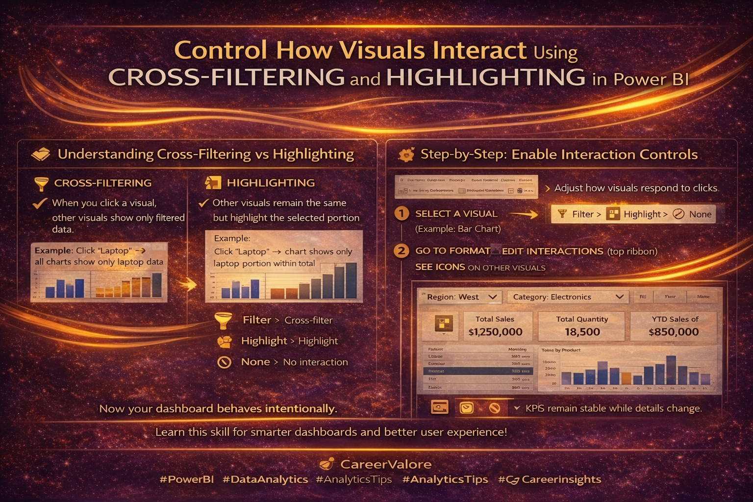
Understanding Cross-Filtering vs Highlighting
There are two main behaviors:
Cross-Filtering
When you click a visual, other visuals show only filtered data.
Example:
Click “Laptop” → all charts show only laptop data
Highlighting
Other visuals remain the same but highlight the selected portion.
Example:
Click “Laptop” → chart shows laptop portion highlighted within total
Both are useful depending on the situation.
How This Connects to Previous Days
Day 21 → Dashboard layout
Day 22 → Slicers for filtering
Today in Day 23, you control how visuals interact with each other
Now your dashboard behavior becomes fully controlled.
Step-by-Step: Enable Interaction Controls
Select a visual (example: Bar Chart)
Go to Format → Edit Interactions (top ribbon)
You will now see icons on all other visuals.
Step-by-Step: Understand Interaction Icons
On each visual, you will see:
Filter icon → Applies cross-filtering
Highlight icon → Applies highlighting
None icon → No interaction
Step-by-Step: Customize Behavior
Example setup:
Bar Chart → Product
Table → Product details
KPI Cards → Total Sales
Now:
Set Product chart to:
- Filter → Table
- Highlight → Another chart
- None → KPI cards
This ensures KPI values remain stable while details change.
Step-by-Step: Test Your Dashboard
Click on a product in the chart.
Observe:
Which visuals change
Which stay constant
Which highlight
Now your dashboard behaves intentionally, not randomly.
What This Means Practically
You control:
What users can explore
What stays constant
How insights are presented
This improves clarity and avoids confusion.
Common Beginner Mistakes to Avoid
Not using Edit Interactions at all
Letting all visuals filter everything
Confusing users with too many interactions
Not testing behavior after setup
Try This Yourself
Pick one chart and:
Disable interaction with KPI cards
Enable filtering for tables
Enable highlighting for another chart
Test different combinations.
You’ll understand interaction behavior clearly.
How Today Builds on Previous Days
Day 22 made your dashboard interactive using slicers
Today in Day 23, you refined interaction behavior
Now your dashboard is:
- Structured
- Interactive
- Controlled
This is how professional dashboards behave.
What Comes Next
Next, you will learn how to use Bookmarks and Buttons to create navigation, reset filters, and build app-like dashboards.
Stay Connected and Keep Practicing
Blogs WhatsApp Channel (for daily quizzes and blog updates):
https://whatsapp.com/channel/0029VbCcWME4inotCWmN5511
Telegram Channel (Job Updates & Career Alerts):
https://t.me/careervalore
WhatsApp Channel (Daily Job Updates):
https://www.whatsapp.com/channel/0029Vay7sUV11ulUI44
Conclusion
Today you learned how to control visual interactions in Power BI.
By managing cross-filtering and highlighting, your dashboard now behaves in a clear and intentional way — improving both usability and user experience.
Leave a Reply