
Introduction
So far, you have built a solid foundation.
You imported data, cleaned it, created relationships, added a calendar, and learned how to build Measures using DAX. Your report now calculates values like Total Sales and Total Quantity just like a real business dashboard.
But there is one important element still missing.
Right now, your report is static. It shows numbers, but the user cannot explore the data.
In real companies, managers don’t want fixed reports. They want to click, filter, and see answers instantly.
That is exactly what you will learn today in Day 6 — how to use Slicers to make your Power BI report interactive.
What You Will Learn Today
By the end of this guide, you will be able to:
Understand what a slicer is and why it is used in dashboards
Add filters that allow users to control what they see
Make your Measures respond dynamically to selections
Create reports that feel like real business tools instead of static charts
Why This Skill Matters for Your Career
Recruiters don’t look for people who can just build charts.
They look for people who can build interactive dashboards.
In workplaces, decision-makers ask questions like:
Show me only South Region sales
Filter this report to Electronics
What happened in January only?
Slicers allow users to answer these questions themselves without asking the analyst to rebuild the report.
This is what turns a report into a decision-making tool.
What Is a Slicer (Explained Simply)
A slicer is like a filter you see on shopping websites.
When you shop online, you select Brand, Price Range, or Category to narrow results.
A slicer does the same thing in Power BI.
It allows the user to choose what data they want to look at, and all visuals update instantly.
How This Connects to What You Built Earlier
Your Measures from Day 5 (Total Sales, Total Quantity, Average Sale Value) were designed to respond to filters.
Today you will finally see why Measures are powerful — because slicers will control them dynamically.
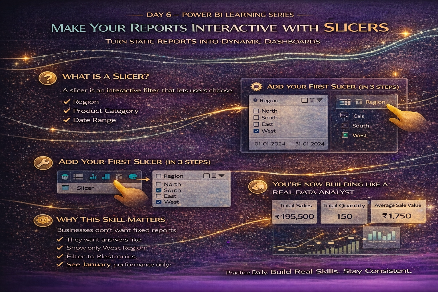
Step-by-Step: Add Your First Slicer (Region Filter)
- Go to Report View.
- Click on an empty space in the report canvas.
- From the Visualizations panel, select the Slicer visual.
- Drag the Region field into the slicer.
You will now see a selectable list of regions like North, South, East, and West.
Click on one region.
Watch what happens.
All your Cards and visuals change automatically.
You just created an interactive report.
Step-by-Step: Add a Product Category Slicer
Now let’s make it more useful.
- Insert another slicer.
- Drag the Category field into it.
Now users can filter by Accessories or Electronics.
Try selecting:
Electronics + West Region
Your Measures instantly recalculate based on the selection.
Step-by-Step: Add a Date Slicer (Using Your Calendar Table)
This is why we created the Calendar table earlier.
- Insert another slicer.
- Drag the Date field from the Calendar table.
- Change slicer type to Between (from the dropdown).
Now you can filter using a date range.
You have just enabled time-based filtering like real corporate dashboards.
What Just Happened Behind the Scenes
You did not change any formulas.
You did not rewrite calculations.
Because you created Measures correctly, Power BI recalculated everything automatically based on slicer selections.
This is how dashboards scale in real organizations.
Common Beginner Mistakes to Avoid
Do not use too many slicers. Start simple.
Always use fields from proper tables (for dates, use Calendar table — not raw data).
Make sure slicers are clearly labeled so users understand them.
Try This Practice Exercise
Use your existing visuals and test the following:
Select only North Region
Then filter Category to Accessories
Then adjust the Date range
Observe how:
Total Sales changes
Total Quantity updates
Average Sale Value recalculates
You are now analyzing data interactively instead of reading static numbers.
How Today Builds on Previous Days
Day 1: You loaded the transaction dataset.
Day 2: You cleaned and structured the data.
Day 3: You created relationships for better modeling.
Day 4: You built a Calendar table for time analysis.
Day 5: You created Measures to define business logic.
Day 6: You added interactivity so users can explore insights themselves.
You are now building something very close to a real-world dashboard.
What Comes Next
Now that your report is interactive, the next step is to visualize trends properly using charts that show comparisons over time and across categories.
We will begin turning these numbers into meaningful visuals.
Stay Connected and Keep Practicing
We run short quizzes and share each day’s learning so you can revise concepts and stay consistent.
Blogs WhatsApp Channel (for daily quizzes and blog updates):
https://whatsapp.com/channel/0029VbCcWME4inotCWmN5511
For early job notifications, career opportunities, and important updates, stay connected here:
Telegram Channel (Job Updates & Career Alerts):
https://t.me/careervalore
WhatsApp Channel (Daily Job Updates):
https://www.whatsapp.com/channel/0029Vay7sUV11ulUIhLBUI44
Conclusion
Today you transformed your report from a static page into an interactive analytical tool.
This is a major step toward thinking like a data analyst. Instead of building multiple reports for different questions, you now built one report that answers many questions dynamically.
Keep practicing with slicers, because almost every professional dashboard uses them.
Leave a Reply