Introduction
Until now, you have done something very important.
You didn’t jump directly into charts like most beginners do. Instead, you built the right foundation — loaded data, cleaned it, created relationships, added a calendar, built Measures, and made the report interactive using slicers.
That is exactly how real analysts work.
Now comes the step most people think is the first step, but is actually the seventh step – visualization.
In Day 7, you will learn how to create meaningful charts that explain the story behind your data, not just decorate your report.
What You Will Learn Today
By the end of this guide, you will be able to:
Understand why charts are used in business reporting
Choose the correct chart for the correct question
Create your first professional visual using your existing Measures
Avoid common mistakes beginners make while building dashboards
Why This Skill Matters for Your Career
Companies don’t hire analysts to prepare tables.
They hire them to answer questions like:
Which region is performing best?
What products generate the most revenue?
Are sales increasing or declining over time?
Charts help decision-makers understand answers in seconds.
Your ability to choose the right visual is what makes your analysis valuable.
Understanding Charts the Simple Way
Think of raw data like reading a full textbook.
Charts are like reading the summary.
They reduce effort, highlight patterns, and help people make faster decisions.
But using the wrong chart is like giving someone the wrong summary confusing instead of helpful.
So today, we focus on using visuals correctly, not just creating them.
How This Connects to Your Previous Work
You already created:
Total Sales (Measure)
Total Quantity (Measure)
Average Sale Value (Measure)
Calendar-based filtering
Region and Category slicers
Today, you will use all of these together to build meaningful visuals.
This is why we didn’t start with charts earlier.
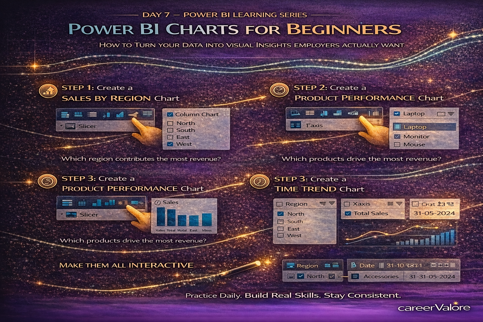
Step-by-Step: Create a Sales by Region Chart
- Go to Report View.
- Click on an empty area.
- From Visualizations, choose Clustered Column Chart.
- Drag Region → X-Axis.
- Drag Total Sales (Measure) → Y-Axis.
You will now see sales comparison across regions.
This answers a real business question instantly:
Which region contributes the most revenue?
Step-by-Step: Create a Product Performance Chart
- Insert another Clustered Bar Chart.
- Drag Product → Y-Axis.
- Drag Total Sales → X-Axis.
Now you can see which products drive revenue.
This is how companies decide:
Which product to promote?
Which product to improve?
Step-by-Step: Create a Time Trend Chart
This is where your Calendar table becomes powerful.
- Insert a Line Chart.
- Drag Date (from Calendar table) → X-Axis.
- Drag Total Sales → Y-Axis.
Now your report shows sales movement over time.
You are no longer looking at totals.
You are analyzing trends.
Use Your Slicers to Make These Charts Interactive
Select different Regions.
Choose a Category.
Adjust the Date range.
Watch every chart update automatically.
You now have a working analytical dashboard.
What Just Happened Behind the Scenes
Your Measures handled calculations.
Your Relationships ensured correct filtering.
Your Calendar enabled time analysis.
Your Slicers allowed interaction.
Your Charts translated numbers into insights.
This combination is exactly how professional dashboards are built.
Common Beginner Mistakes to Avoid
Do not add too many charts. Clarity is more important than quantity.
Never use Pie Charts for complex comparisons. Use bar or column charts instead.
Always use Measures, not raw columns, inside visuals.
Label visuals clearly so users understand what they are seeing.
Try This Practice Exercise
Create a report page containing:
Sales by Region (Column Chart)
Sales by Product (Bar Chart)
Sales Trend Over Time (Line Chart)
Then use slicers to answer:
Which region sold the most Electronics?
Which product performs best in the North region?
You are now asking analytical questions — not just viewing data.
How Today Builds on Previous Days
Day 1: Data was introduced.
Day 2: Data was cleaned.
Day 3: Relationships were created.
Day 4: Time intelligence structure was added.
Day 5: Measures defined business logic.
Day 6: Slicers enabled interaction.
Day 7: Charts transformed analysis into visual storytelling.
You are now doing what entry-level data analysts are expected to do in real jobs.
What Comes Next
Now that you can build visuals, the next step is learning how to design dashboards properly — arranging visuals, highlighting KPIs, and making reports look professional and easy to read.
This is where your work starts looking like something you can show in a portfolio.
Stay Connected and Keep Practicing
We share short quizzes and learning reinforcements based on each day’s topic so you can test your understanding.
Blogs WhatsApp Channel (for daily quizzes and blog updates):
https://whatsapp.com/channel/0029VbCcWME4inotCWmN5511
For job alerts and career updates, stay connected here:
Telegram Channel (Job Updates & Career Alerts):
https://t.me/careervalore
WhatsApp Channel (Daily Job Updates):
https://www.whatsapp.com/channel/0029Vay7sUV11ulUIhLBUI44
Conclusion
Today you learned how to present data in a way that decision-makers understand immediately.
You didn’t just create charts. You connected data, logic, and interaction to explain performance clearly.
That ability — turning numbers into understanding — is what makes someone job-ready in analytics.
Keep building. You are now moving from learning Power BI to actually using it like an analyst.
Leave a Reply