
If you’ve ever seen a Pie Chart with 50 different slices, you’ve witnessed a “Data Crime.” It’s messy, impossible to read, and it hides the truth.
Data visualization is not about making things “pretty.” It is about reducing the brainpower required to understand a fact. Today, we’re going to master the “Big Three” charts that will handle 90% of your professional life..
The “Chart Overload”
You’ve got your Pivot Table ready. You click “Insert Chart” and Excel shows you 50 options: Sunbursts, Radars, Histograms, Funnels.
You pick one that looks “cool,” but when you show it to your team, they ask: “Wait, what am I looking at?” This is the moment most beginners lose their confidence. The problem isn’t the data; it’s the translation.
Matching the Chart to the Question
To pick the right chart, you must first ask: What is the reader trying to find out?
- Are they comparing items?
- Are they looking at a trend over time?
- Are they looking at how a “whole” is split up?
Once you know the question, the chart chooses itself.
The “Big Three” Hierarchy
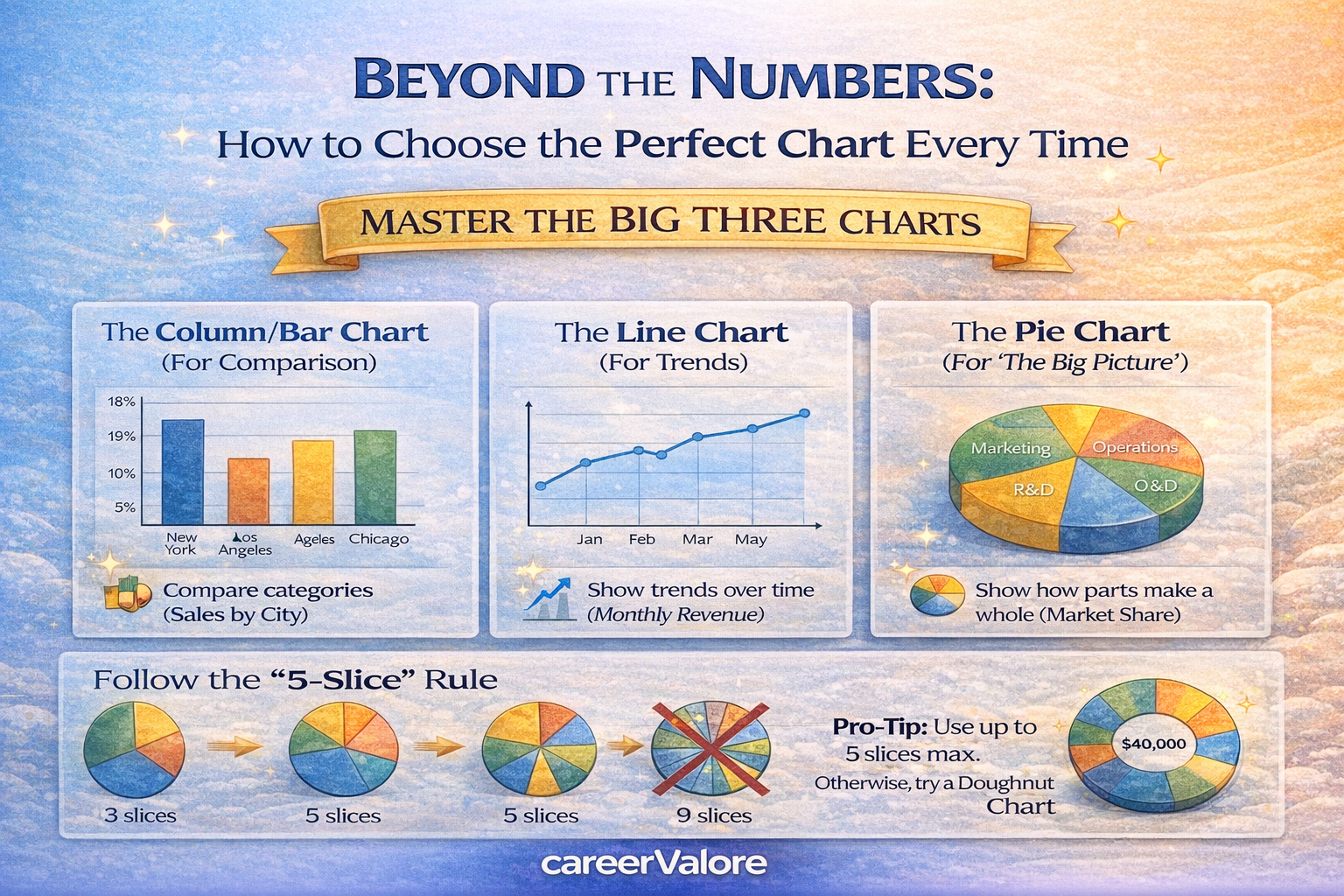
1. The Column/Bar Chart (For Comparison)
Use this when: You want to compare different categories (e.g., Sales by City, Most Popular Pizza Toppings).
- The Rule: If you have long names for your categories, use a Horizontal Bar Chart so the text is easier to read.
- Avoid: Using this for time (like months). Use it for “buckets” of things.
2. The Line Chart (For Trends)
Use this when: You want to show how something changes over time (e.g., Stock prices, Weight loss, Monthly Revenue).
- The Rule: Time always goes on the bottom (the horizontal axis).
- Why it works: Our brains are wired to follow lines. A rising line feels like “success”; a falling line feels like a “warning.”
3. The Pie Chart (For “The Big Picture”)
Use this when: You want to show how parts make up a whole (e.g., Market share, how you spend your salary).
- The Rule: Never use more than 5 slices. If you have 10 categories, the slices become too small to compare.
- Pro-Tip: Use a Doughnut Chart (a pie with a hole in the middle) to look more modern and save space for a “Total” number in the center.
The “Golden Rule” of Dashboards: Keep It Simple
A great dashboard follows the 5-Second Rule: If a person can’t understand the main point of your chart in five seconds, it’s too complicated. Remove the background gridlines, turn off the 3D effects, and let the data speak.

Your 5-Minute Mission (Action Step)
Let’s test your “Designer Eye.”
- Think about your Sleep Patterns over the last 7 days.
- If you wanted to show your boss how your sleep hours changed from Monday to Sunday, which chart would you use? (Hint: It’s a trend!)
- If you wanted to show which percentage of your day is spent Sleeping vs. Working vs. Relaxing, which chart would you use?
Answers: 1. Line Chart. 2. Pie/Doughnut Chart.
Leave a Reply