
Introduction
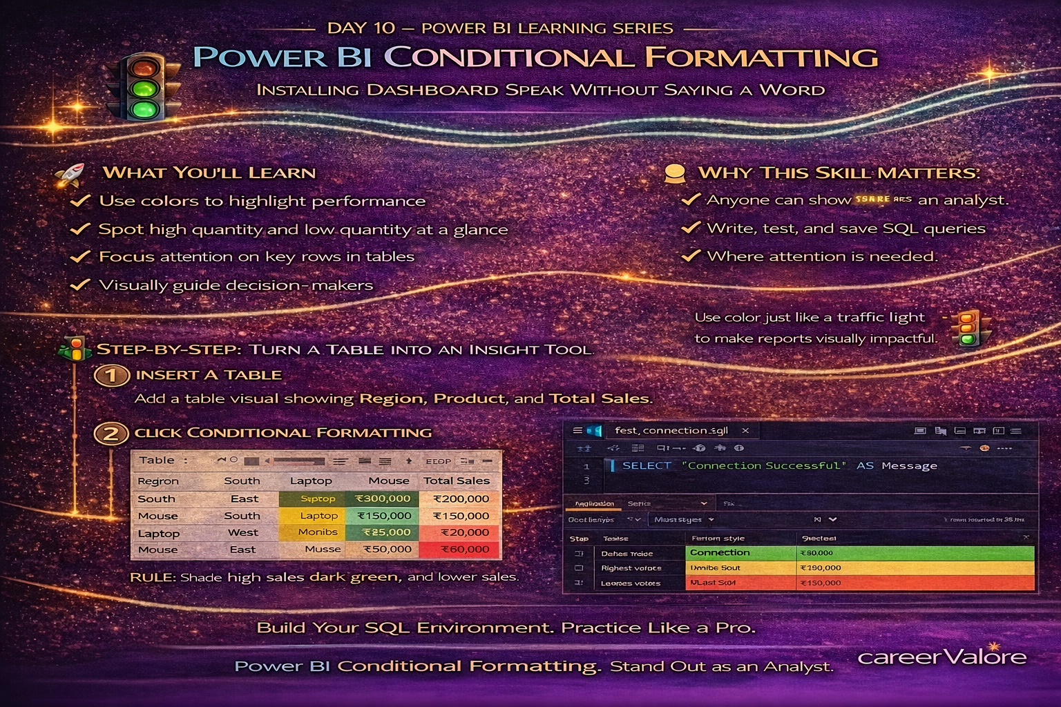
Until now, your dashboard has shown numbers, comparisons, and top performers clearly. But in real business reports, decision-makers should not have to study charts carefully to understand what is good or bad.
The report should guide their eyes automatically.
This is where conditional formatting becomes powerful. It allows your dashboard to highlight insights visually so that performance stands out instantly.
In Day 10, you will learn how to use conditional formatting to turn your report into something that communicates meaning at a glance.
What You Will Learn Today
You will understand how to apply color-based insights to visuals
You will highlight high and low performance automatically
You will make tables easier to interpret
You will improve dashboard readability using visual cues instead of extra charts
Why This Skill Matters for Your Career
Managers do not read reports line by line. They scan.
Conditional formatting helps them immediately notice:
Where sales are strong
Where performance is weak
Where attention is needed
This technique is widely used in executive dashboards, financial reports, and operational analytics. Knowing how to apply it shows that you understand how businesses consume data, not just how to build visuals.
Understanding Conditional Formatting in Simple Terms
Think about a traffic signal.
Green means go.
Red means stop.
No one reads instructions. The color itself communicates the message.
Conditional formatting does the same thing for your data.
How This Connects to What You Already Built
You created measures like Total Sales. You filtered Top and Bottom performers. Now you will visually emphasize those results so insights become obvious.
Step-by-Step: Apply Conditional Formatting to a Table
Insert a Table visual if you don’t already have one.
Add the following fields:
Product
Region
Total Sales
Now the table shows numbers, but nothing stands out yet.
Step-by-Step: Add Color Based on Sales Value (Latest Power BI UI)
Click the table visual.
Open the Format pane (paint roller icon).
Expand Cell Elements.
Turn ON Background Color.
Click the fx button.
Step-by-Step: Define the Color Scale
Change Format style to Color scale.
Choose:
Lowest value → Light color
Highest value → Dark color
Click OK.
Power BI now automatically shades higher sales with stronger color and lower sales with lighter tone.
What This Means Practically
Without adding any extra visuals, you made performance visible.
Anyone looking at this table can instantly identify which rows represent strong business contribution.
Step-by-Step: Highlight Underperformance Using Rules
Open Conditional Formatting again.
Choose Rules instead of Color scale.
Set a rule like:
If value is below 10,000 → Show warning color.
Now weaker sales are clearly visible.
Common Beginner Mistakes to Avoid
Do not use too many colors. Keep meaning consistent.
Avoid bright decorative colors that distract from insight.
Always format based on business logic, not appearance.
Try This Yourself
Apply conditional formatting to your Region-wise sales table.
Then change slicers and watch how the colors adjust automatically.
This dynamic response is what makes dashboards feel intelligent.
How Today Builds on Previous Days
You identified top performers in Day 9. Today you enhanced that analysis visually so performance is recognized instantly.
You are now combining calculation, filtering, and visual communication — the three pillars of professional reporting.
What Comes Next
Next, you will begin creating comparison metrics such as growth and change over time, which will help your dashboard answer not just “what is happening,” but “how things are changing.”
Stay Connected and Keep Practicing
Blogs WhatsApp Channel (for daily quizzes and blog updates):
https://whatsapp.com/channel/0029VbCcWME4inotCWmN5511
Telegram Channel (Job Updates & Career Alerts):
https://t.me/careervalore
WhatsApp Channel (Daily Job Updates):
https://www.whatsapp.com/channel/0029Vay7sUV11ulUIhLBUI44
Conclusion
Today you transformed your dashboard from informative to intuitive.
Instead of asking users to analyze numbers manually, you allowed the report itself to guide interpretation. This is a key step toward building dashboards that leaders actually rely on.
Leave a Reply